
The Results Are In
- Holly A. Tompkins
- Aug 22, 2021
- 1 min read
Updated: Mar 5, 2024
First off, a wholehearted thanks to everyone who took the time and interest to share their thoughts and opinions about CAYUGA's graphics options.
The bold blue lettering got a slim majority. And we loved your comments on the matter. They ranged from, "whatever is less expensive...ha" to "Get ‘er done! ….spill some rum on the letters to give it patina!". There were some very thoughtful comments on how the blue would be a better contrast and seen from afar to "likely to be outvoted but the stern is big enough".
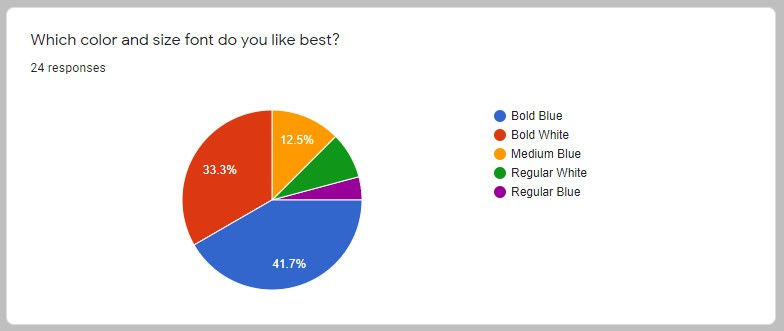
In the beginning, it was all bold blue carrying the day but as the vote went on, bold white was pulling up fast. Bold blue got 10 votes and bold white 8. There were a few folks who sent texts and unfortunately, the poll won't reflect those votes, but thanks to Jack and Berke for their bold white votes, so in the end - we have a tie! So, what did we ultimately go with?

With history on our minds, we took the cue from PUG and did what was originally done. The blue outline would be our little touch but PUG led us to the right font. I know there's a graphics person out there who is grateful...
We can't thank Accent Graphics enough for putting up with a zillion font ideas, pondering and then some more pondering, and finally this past week, Wednesday morning, Jake came out to the marina and applied the name to the transom. Done!


Comentários